“Causal graph” sounds like jargon, but the idea is almost embarrassingly simple — and once it clicks, a lot of confusing things about data suddenly make sense. So let’s build one from scratch, with no equations, and see what it’s actually for.
Nodes and arrows — that’s the whole vocabulary
A causal graph has exactly two ingredients. Nodes are the things you can measure — a temperature, a price, ice-cream sales, whether it rained. Arrows connect them, and an arrow means something very specific: this one causes that one. An arrow from A to B is a claim that if you reached in and changed A, B would change in response. No arrow means no direct causal influence.
The direction is the entire point. A correlation is symmetric — A and B just move together, and it can’t tell you which way the influence runs. An arrow is not symmetric. It commits to a story: cause on this end, effect on that one. That single commitment is what separates a causal graph from an ordinary chart of what-correlates-with-what.

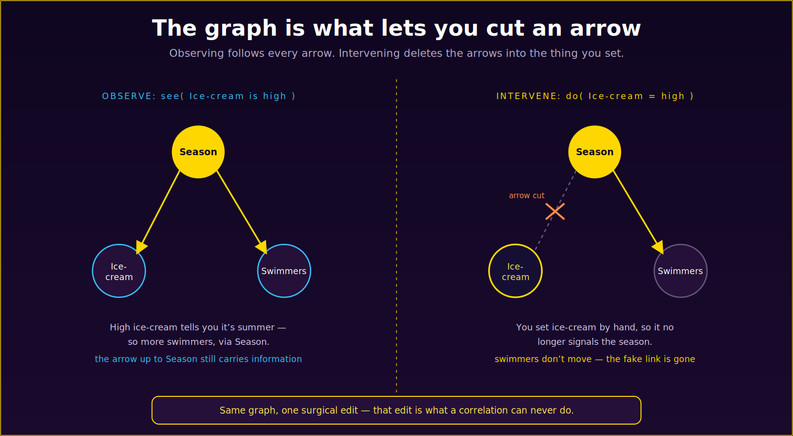
Take the classic puzzle. Ice-cream sales and drownings rise and fall together, yet neither causes the other. Draw the graph and the mystery evaporates: Season is a node with an arrow to ice-cream sales and another arrow to swimmers in the water (which in turn has an arrow to drownings). Ice-cream and drownings have no arrow between them at all. They move together only because they share a common cause upstream. The graph shows you the real structure — and the absent arrow is doing just as much work as the ones that are there.
Why the arrows matter: you can cut one
Here’s where a causal graph stops being a pretty diagram and becomes a tool. Because the graph knows the direction of every influence, it can do something a correlation table never can: it can tell you what happens when you intervene instead of merely observe.
Observing and intervening are different acts, and the graph treats them differently. When you simply see that ice-cream sales are high, you can reason backward up the arrow — high sales suggest it’s summer, which suggests more swimmers. Information flows along every arrow, in both directions of inference. But when you intervene — when you force ice-cream sales high yourself, say with a giant promotion in winter — something changes in the graph itself.

The rule is beautifully simple. When you set a variable by hand, you delete the arrows pointing into it — because its value no longer comes from its usual causes; it comes from you. Force ice-cream sales high and the arrow from Season into ice-cream is cut. Ice-cream no longer tells you anything about the season, so it no longer tells you anything about swimmers. The spurious link vanishes, and the graph correctly predicts what common sense already knew: your winter ice-cream stunt does nothing to drownings. That little act — cutting the incoming arrows — is the mathematical heart of the difference between “see” and “do,” and it’s something you simply cannot compute from correlations alone.
The same graph answers three kinds of question
Once you have the structure, the same graph serves three levels of question. It predicts (follow the arrows forward). It tells you the effect of an action (cut the incoming arrows, then follow the rest). And it supports counterfactuals (ask what a specific case would have done under a different setting). One diagram, three jobs — which is why the graph, not the dataset, is the thing worth building.
Where do the arrows come from?
A fair question: who decides where the arrows go? Sometimes you know from domain knowledge — physics, biology, plain sense. Sometimes you learn them from data, which is the job of causal discovery. And this is where the ability to intervene becomes a superpower: from observation alone you often can’t tell whether A causes B or B causes A, but if you can act on A and watch whether B moves, the arrow’s direction reveals itself. Experiments are, at bottom, a way of drawing arrows you couldn’t draw by watching.
The bottom line
A causal graph is just nodes and directed arrows — but that modest picture carries the one thing a pile of correlations never can: the direction of influence, and therefore the license to reason about intervention. It tells you what causes what, what merely looks connected, and what would happen if you changed something. That’s not a diagram of your data. It’s a model of your world — and it’s the difference between describing what happened and knowing what to do.
Leave a Reply