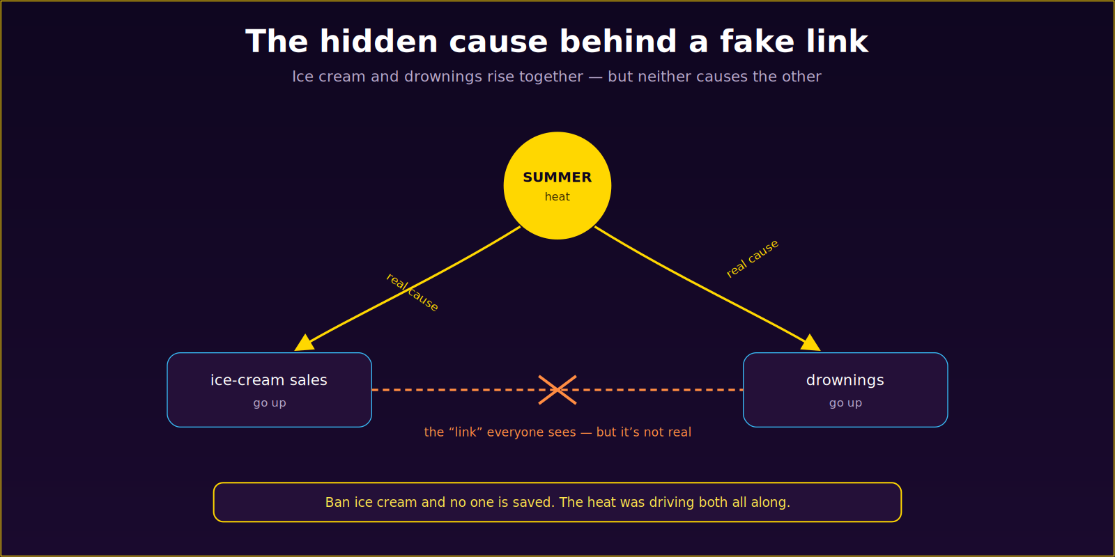
Here is one of the most reliable statistics you will ever meet: on the days when a town sells the most ice cream, the most people drown. The numbers are real. The correlation is strong. And it has fooled exactly no one — because everybody knows the missing piece.
It’s summer. Hot days sell ice cream and send people into the water. The heat drives both. Ice cream and drowning have nothing to do with each other; they just happen to share a cause. Ban ice cream and you’ll save no one — you’ll just have hot, miserable, still-drowning swimmers.

Everyone laughs at the ice-cream example. It’s in every intro stats class precisely because the trap is so obvious. But here’s the uncomfortable part: the exact same mistake, dressed in business clothes, gets made in boardrooms and dashboards every single day — and there it fools almost everyone.
The trap in a suit
Strip the summer out of the picture and the confusion becomes invisible. The structure, though, is identical.

“Users who adopt feature X churn less — so let’s push X on everyone.” But maybe already-engaged users both adopt X and stick around; the engagement is the summer. Force X on indifferent users and nothing happens. “Coupon recipients spend more — send more coupons.” But the coupons went to loyal customers who’d have spent anyway. “Bigger hospitals have higher death rates.” Of course — the sickest patients go there. Each of these is ice cream and drownings, and each has a real budget, a real strategy, and real consequences riding on getting it wrong.
The one question that breaks the spell
There’s a simple test that catches every version of this trap, and it’s worth committing to memory:
“If I intervene and change this myself — not just watch it — does the outcome still move?”
Watching ice-cream sales tells you drownings will follow. Changing ice-cream sales tells you they won’t. The gap between those two — between observing something and intervening on it — is the whole difference between a correlation and a cause. A correlation is a question. Only intervention answers it.
This is exactly why models that only learn correlations are dangerous the moment you act on them. They see the ice cream and confidently recommend the ban. A model that reasons about cause asks the harder question first — what actually moves the outcome if I reach in and change it? — and gives you an answer you can spend money on.
The takeaway
Next time a chart shows two lines moving together and someone reaches for the obvious conclusion, do the ice-cream check. Ask what else might be driving both. Ask whether anyone has ever intervened, or only watched. Most of the expensive mistakes in data-driven decision-making aren’t failures of math. They’re failures to ask whether the summer is hiding in the background — and it usually is.